
Reading Time: Six Minutes
Alternative Text (alt text) is the HTML tag that provides descriptions of images on screens. That’s the basic definition, but it’s also a crucial element impacting the digital experience for people using screen readers and other types of assistive technology. When considered from this perspective, it’s a key component of UX Design and deserves as much effort as creating and selecting visual assets.
Screen readers are assistive technology that facilitate the connection between content and screens by reading aloud both visible and invisible text included in alt text. Many blind and low-vision users rely on screen readers to access digital content, perform daily tasks, and work. The JAWS screen reader, the most widely used screen reader for Windows, was released in 1995 and the Web Content Accessibility Guidelines (WCAG 1.0) were released in 1999. These developments were pivotal in creating a more inclusive digital world. But just over 25 years later, it’s still a nascent field that feels big on basic compliance and small on creating great experiences. This is changing as companies recognize the importance of inclusive design for both their customers and employees and implement policies that better support them.
There are many resources out there that cover the basics of alt text compliance rules. This article is about going beyond compliance to create a more enriching and flavorful digital experience. We’ve been working with our new accessibility lead Colin Wong to go “beyond compliance” on our company site and want to share a few practices that we’ve implemented along the way.
“But just over 25 years later, it’s still a nascent field that feels big on basic compliance and small on creating great experiences.”
1. Experience Alt Text
Begin the alt text initiative by navigating the site, app, or software using a screen reader. It’s a very different experience from reading by sight and enlightening to experience firsthand. VoiceOver is built into Mac OS and Narrator is built into Windows. Alternatively, review the site with a person who relies on screen readers and note their feedback. Ask detailed questions along the way and capture issues that arise.
2. Audit & Document
Conduct an image audit of every screen and every image, including interactive elements and controls. We used a Chrome plugin called “Image Downloader” to identify images on each webpage, but the Google Chrome browser’s built-in Developer tools can also be used to see an image list. The images were then itemized by page in a shared spreadsheet with columns for adding alt text and collaborating on edits.
3. Go Beyond the “Image”
The basic image description elements are the subject matter—a person/people, place, or thing, and their context—where they are and what they are doing. Colin advises to “Close your eyes and imagine what would be most helpful to convey the overall meaning of the image.” Describing the type of image, such as “photo” or “diagram” can add additional context. Screen readers add the word “image” (Windows Narrator) or “graphic” (Jaws) when they read image alt text, so the type of image must be more specific in order to avoid being redundant. Here are a few more ideas for further enriching descriptions.
Photos
If people are present in photographs, include age range, gender, and any apparent activity or occupation. We debated whether or not to include ethnicity and opted to include it as it felt important to be representational. How ethnicity and gender are described may be up for debate, so do due diligence for descriptors.
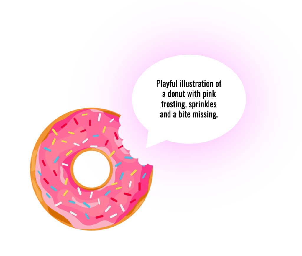
Illustrations
Illustrations by their nature typically create a friendlier less formal tone, so just by labeling it an illustration, additional information is conveyed. If an illustration is technical in nature, such as a scientific illustration, include that in the description.
Icons
Icons are frequently used in sets and since many may be present, use super concise descriptors: “Phone Icon in a green circle.”
Diagrams
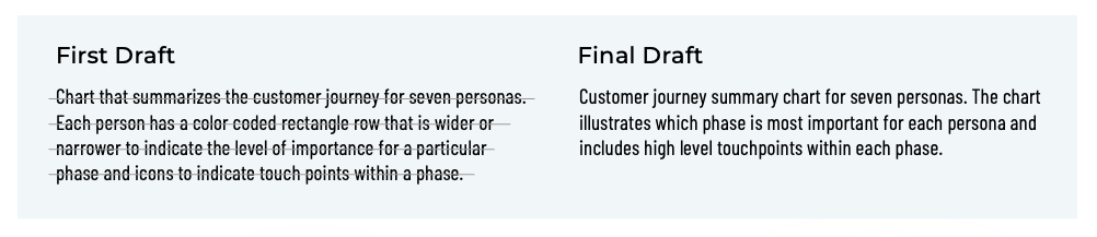
Since we are a UXD/UXR agency, our website includes many different types of diagrams, so we got a bit more specific and included the diagram types such as “line chart” or “infographic.” The diagrams were the most challenging to describe because they contain a lot of detail. When possible, link to a screen reader-friendly source diagram to allow a more concise description and provide screen reader users with the same information as those reading by sight. If linking isn’t possible, focus on what the diagram is conveying rather than a literal description.
“Close your eyes and imagine what would be most helpful to convey the overall meaning of the image.”
— Colin Wong, Accessibility Lead
Logos
We initially described our logo as “gotomedia logo” and then revised it to include a brief description of the logo’s visual attributes “gotomedia logo mark, stylized capital G.”
Animations
Animations greatly enrich digital experiences and describing them in alt text can do the same. The challenge is to describe the motion and visuals accurately but also succinctly.
4. Convey the Flavor
Image subject matter isn’t the full picture. Use adjectives to convey the flavor and establish the image tone. Is the image playful and bright? Or dark and moody?
5. Strike a Balance
Screen readers read the image description as they are reading the primary content on the screen. Strike the right balance between enriching the experiences with descriptive alt text and writing too much and detracting from the primary content. It may take a few passes to create descriptions that are “flavorful” AND concise.
6. Take a Breath
Punctuation, or its lack, impacts the experience. It makes content easier to understand and helps to convey meaning. This is especially true for screen readers since the addition of punctuation affects how they move from one text section to the next. A period will prompt the screen reader to “take a breath,” and a comma will add a shorter pause. Since the reader is moving between reading the primary content on the screen and describing images, this can be a helpful signpost to maintain context and indicate moving to a different area of the screen.
7. Test it Out
After creating an initial draft, read the alt text to a colleague or friend then share the image with them. Did the alt text paint an accurate and flavorful picture? This isn’t necessary for every image, it but can help with learning to create flavorful alt text and describing tricky or complex images.
These small changes add up to create an enriched experience for a broader spectrum of readers. Attention to this aspect of the UX not only creates a better experience but also demonstrates care and commitment to users who rely on screen readers.